5 Design Mistakes Killing Your Brand in 2026 (And How to Fix Them)

In 2026, your brand’s first impression happens in less than 3 seconds. If your logo, website, or social media visuals look outdated, cluttered, or unprofessional, you are silently losing customers every single day.

At Creatohub Digital Studio, we see the same 5 design mistakes repeated across almost every Bangladeshi business we audit. The scary part? Most owners don’t even realize these mistakes are hurting their sales and credibility.

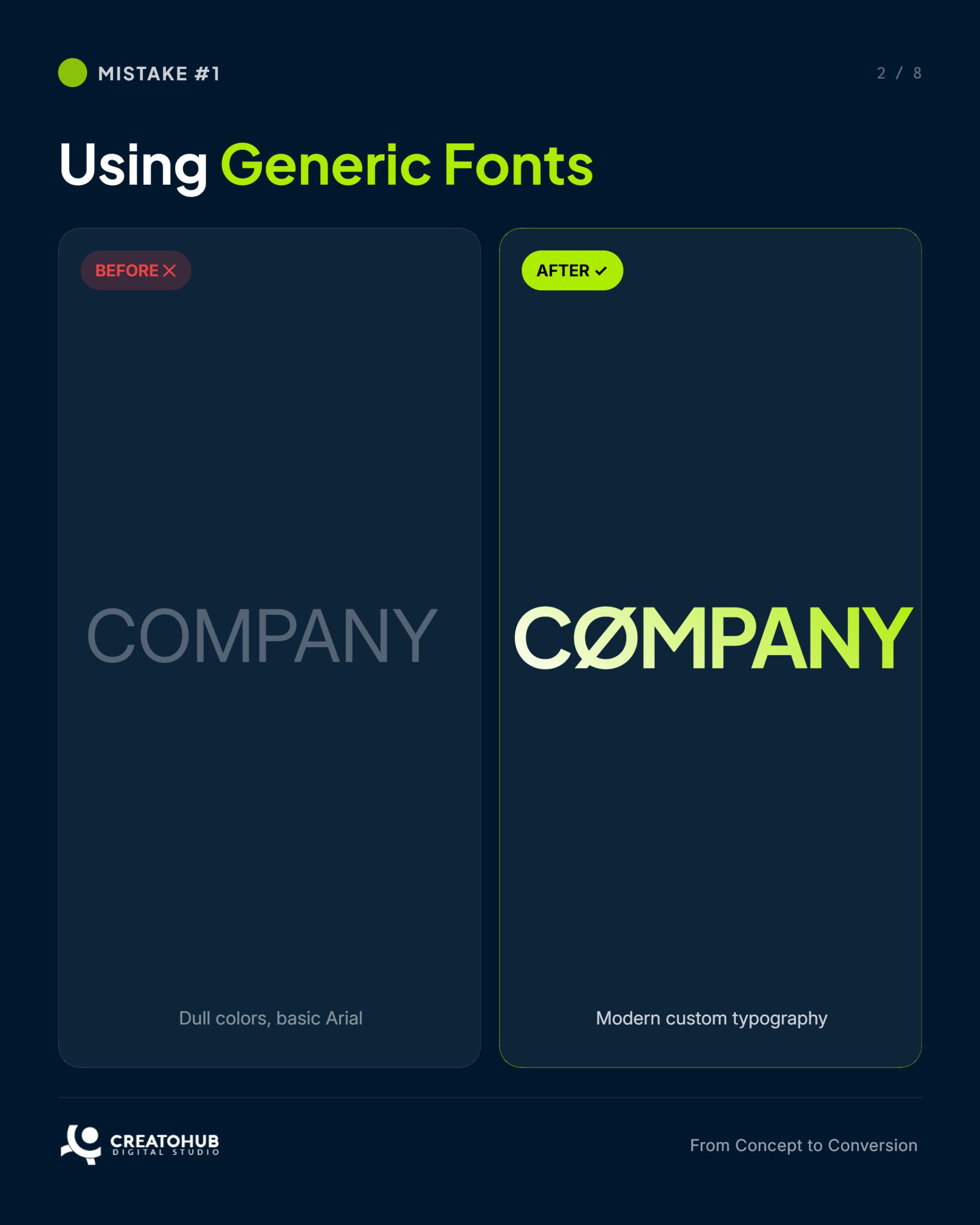
In this guide, we break down each mistake with real before-and-after examples, explain exactly why it’s killing your brand, and show you the simple fixes that deliver instant results.

Read till the end — and discover how professional design can turn your brand into a conversion machine.

1. Using Generic Fonts

The “Everyone Looks the Same” Mistake

Why it kills your brand: When you use default fonts like Arial, Times New Roman, or Calibri, your brand instantly looks cheap and forgettable. Customers can’t tell you apart from thousands of other businesses.

Before vs After

  • Before: Basic Arial logo in black and white → looks like a 2015 template.
  • After: Custom typography with bold weights and unique character spacing → instantly premium and memorable.

The Fix: Choose 2–3 fonts maximum. One for headlines (bold and modern), one for body text (highly readable). Let your typography reflect your brand personality.

Creatohub Tip: We create custom font pairings that are unique to your industry and perfectly match your brand colors (#ACEC00 & #00182e).

2. Ignoring Mobile-First Design

(The “70% of Your Customers Can’t Read This” Mistake)

Why it kills your brand: Over 70% of users in Bangladesh browse on mobile phones. If your website or visuals look broken on mobile, people leave within seconds.

Before vs After

  • Before: Desktop-only layout that forces horizontal scrolling on phones.
  • After: Clean, fast-loading, thumb-friendly design that looks perfect on every device.

The Fix: Design everything with mobile-first approach. Test on real phones, not just desktop previews. Large buttons, readable text, and fast load times are non-negotiable in 2026.

Creatohub Tip: Every website and social creative we deliver is 100% mobile-optimized from day one.

3. Poor Contrast & Readability

The “Nobody Can Read What You Wrote” Mistake

Why it kills your brand: Low contrast text (white on light background, light gray on white, etc.) makes your message invisible. Users scroll past without reading a single word.

Before vs After

  • Before: Light text on light background → almost invisible.
  • After: Bold, high-contrast text using #ACEC00 on #00182e → instantly readable and eye-catching.

The Fix: Follow WCAG accessibility standards. Minimum 4.5:1 contrast ratio for body text. Use your brand accent color (#ACEC00) strategically for headlines and CTAs.

Creatohub Tip: We always test every design for readability across all devices and lighting conditions.

4. Cluttered & Overcrowded Design

The “Too Much Everything” Mistake

Why it kills your brand: When you try to show everything at once, the viewer sees nothing. Clutter creates visual noise and zero attention.

Before vs After

  • Before: Flyer or website packed with 15 elements and tiny text.
  • After: Clean layout with plenty of white space, one clear message, and strong visual hierarchy.

The Fix: Apply the “Less is More” rule. Remove anything that doesn’t serve the main goal. Use breathing space generously.

Creatohub Tip: Our signature style is bold minimalism — maximum impact with minimum elements.

5. Staying Stuck in Outdated 2020 Design Trends

The “You Look Old” Mistake

Why it kills your brand: Flat design, heavy drop shadows, and basic gradients scream “2020”. In 2026, customers expect modern 3D elements, subtle AI touches, micro-animations, and premium depth.

Before vs After

  • Before: Flat, dated design that feels old.
  • After: Modern 2026 style with soft 3D, neon accents (#ACEC00 glow), and sophisticated gradients.

The Fix: Stay updated with current trends while keeping your brand identity consistent. Refresh your visuals every 12–18 months.

Creatohub Tip: We combine timeless branding with trending 2026 aesthetics so your design never goes out of style.

Final Takeaways

Fix These Mistakes Today

Here’s the truth: Great design is no longer a luxury — it is a business necessity in 2026.

Fixing these 5 mistakes can:

  • Increase brand trust instantly
  • Boost conversion rates dramatically
  • Make your business look bigger and more professional than your competitors

Ready to stop losing customers because of bad design?

Book your FREE Brand Audit with Creatohub Digital Studio today.

✅ DM us “DESIGN” on Facebook or Instagram
âś… Or Click Here
âś… WhatsApp: +8801919217406

We will review your current branding, website, and socials and show you exactly where you’re losing money — at no cost.

Creatohub Digital Studio From Concept to Conversion

What do you think?

Your email address will not be published. Required fields are marked *